Walnut vs Oak for Interior Furniture
Walnut and oak are the two timbers we are asked about most. They are not rivals — they do different jobs.
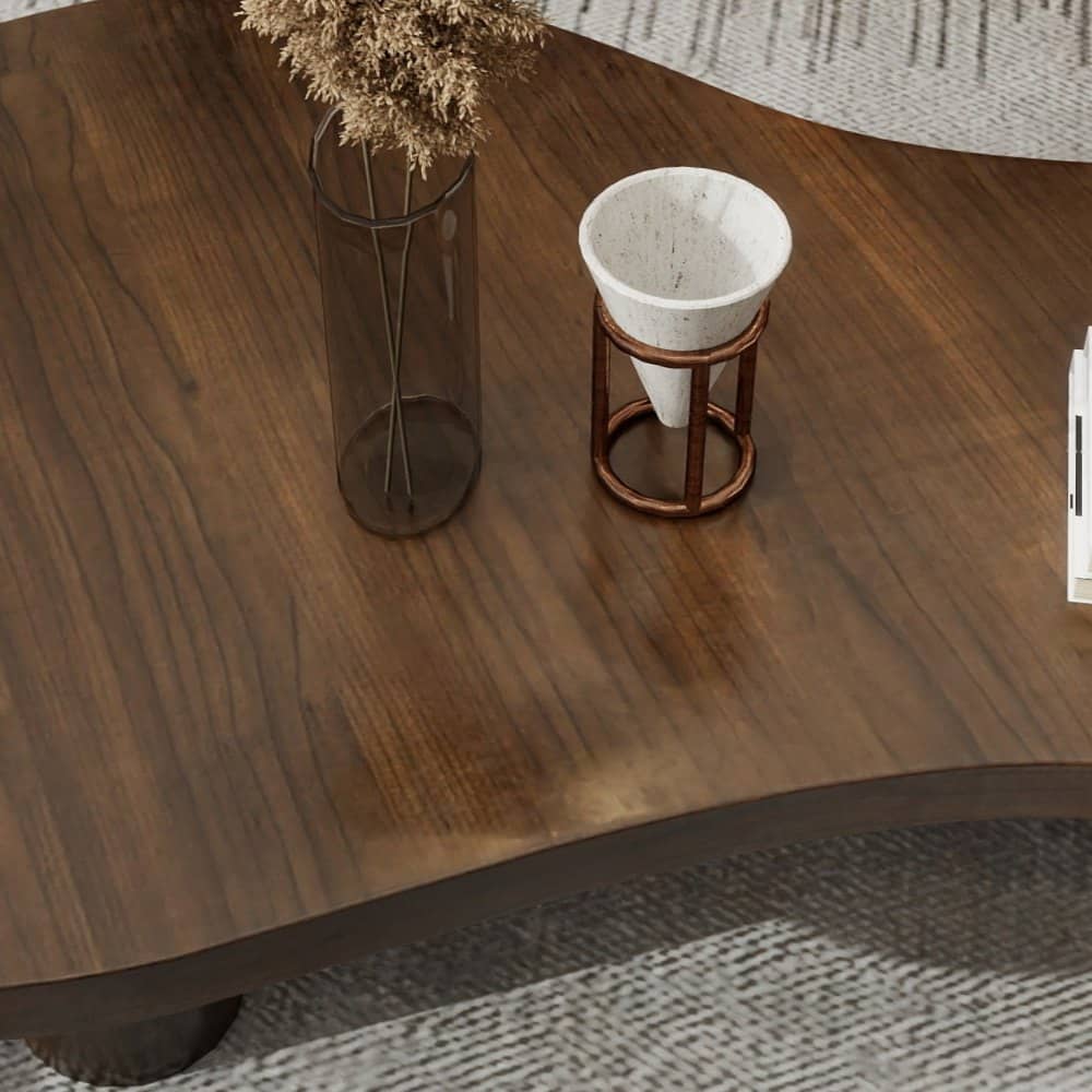
Choosing between walnut and oak is less about which is better and more about what a room needs. One adds depth; the other adds calm.
Tone
Walnut ranges from warm chocolate to lighter brown, often with purple or grey undertones. Oak is paler, from straw to honey. In a room with pale walls and floors, walnut becomes a focal point; oak blends and brightens.
Grain
Walnut’s grain tends to be more varied and figured, which rewards large, uninterrupted surfaces such as tabletops. Oak’s grain is more linear and even, which suits repetition — wall panelling, runs of cabinet doors, shelving.
Change over time
All natural timber responds to light. Walnut often mellows and lightens slightly; oak may warm towards amber, depending on the finish. We explain what to expect for a specific timber and finish before you choose.
Where to use each
- Walnut tones: dining and coffee tables, desks, statement cabinetry, bed frames.
- Oak tones: wall panelling and wainscot, wardrobe interiors, open shelving, larger joinery runs.
Using both
Many of our interiors use both registers: darker timber for freestanding furniture and paler timber for the architecture around it. In the Garden Residence, a dark walnut-toned coffee table sits within rooms lined with paler timber wainscot and shelving.
Finishes
The finish changes a timber as much as the species does. Oiled finishes keep an open, natural feel and can be refreshed locally, but need occasional maintenance. Lacquers offer more protection against marks and moisture with less upkeep, and can be specified with a very low sheen so the timber still looks natural. Tinted finishes can shift a timber’s tone, although we generally prefer to choose a timber for its natural colour.
Pairing with stone and metal
Dark walnut tones sit beautifully against pale, veined stone and warm bronze-toned metal — the contrast lets each material read clearly. Pale oak tones pair with warmer stones, plaster and darker metals, creating a softer, more tonal composition. Our stone and metal pages show both approaches.
In practice
For a first commission, a common approach is to choose the timber for the most important freestanding piece — usually the dining or coffee table — and then decide whether the surrounding joinery should contrast or harmonise with it. Samples viewed in the room, in both daylight and evening light, make the decision far easier than any photograph.
Explore walnut and oak in our material library, or see custom wood furniture.
Continue reading
Tell us about your space.
Share your floor plan, room photographs and what you hope to create.